 In commercial art we had to show meaning using text for a food and an animal, one had to be done using photoshop and one by hand. I chose Caribou Coffee as my food because I love that place and its amazing. I used their old logo to write out "caribou" and theircoffee cups and beans to write out "coffee". For the background I found a picture of multiple coffee beans and brought the opacity down. I created the border using photoshop.
Wednesday, May 26, 2010
Caribou Coffee
In commercial art we had to show meaning using text for a food and an animal, one had to be done using photoshop and one by hand. I chose Caribou Coffee as my food because I love that place and its amazing. I used their old logo to write out "caribou" and theircoffee cups and beans to write out "coffee". For the background I found a picture of multiple coffee beans and brought the opacity down. I created the border using photoshop.Thursday, April 1, 2010
Post 3D Ad. Reflection
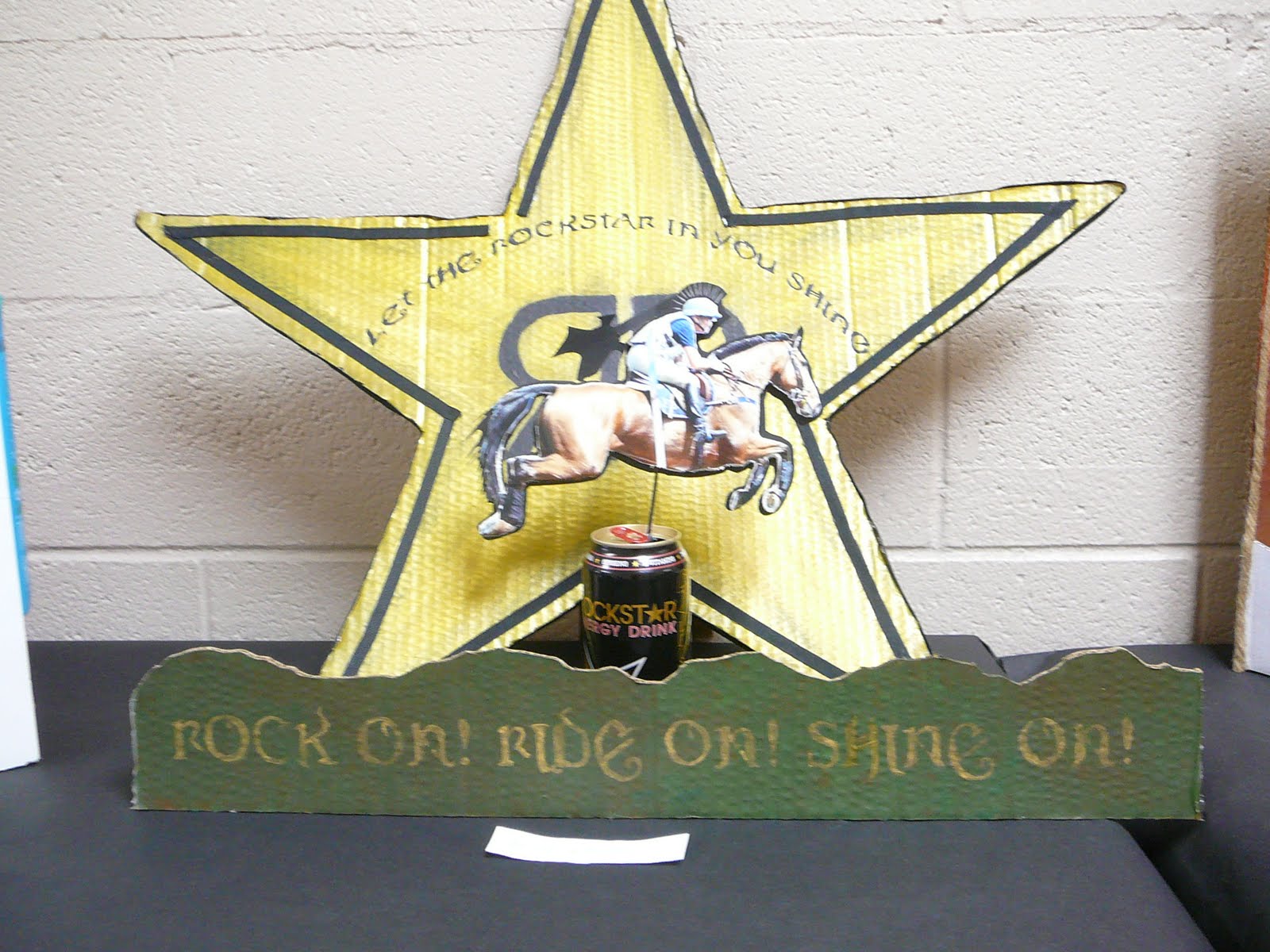 3D Advertisement: Rockstar
After reviewing my final product my strongest attribute was my use of material. The ribbon on the star was a good plus because then you can't see the edge of the cardboard. Some things that I could have done differently is not had the gap in the ribbon and put some red on the star because there is red on the can. Also I could have made the second slogan brighter if I had had more time.
Monday, March 29, 2010
Monday, March 8, 2010
Movement

The principles of design are contrast, repetition, unity, movement, balance, rhythm, and emphasis. I enjoy using photshop because it is fun and there is a lot of different things you can do. There are always new tools that I am finding to use.
Subscribe to:
Comments (Atom)
